

Heuristic UX Audit & Redesign
Byosaz (OSAZ) sells AI-personalized skincare to a B2C audience that needs to trust the brand before they trust the formula. I audited the live storefront end to end and found a site that photographs beautifully and quietly breaks its own promises, buttons that don’t click, results that don’t match what the user told it, copy no one proofread. This is that audit, and the redesign that followed it.
Role
UX Designer + 1 UX Researcher
Subject
byosaz.com B2C Shopify storefront
Scope
Home, PDP, Cart, Skin Survey/Results
Method
Heuristic audit (Nielsen’s 10) + teardown

Root cause
Every flaw in this audit is a symptom of the same decision: OSAZ designed for the photo, not the click. Styling was finished before interaction was. The result is a site that looks like a finished brand and behaves like a mockup.
That’s not a one-off bug. It’s a pattern that shows up on five different pages, in five different ways and it’s why this audit is structured around interaction integrity first, decoration second.

7
non-functional or dead-end elements found across the storefront- buttons, icons, and tiles that look interactive and aren’t
1
grammatically broken line in the site’s own trust banner: “Free shipping for on all orders.”
5
distinct pages audited end to end home, collection, PDP, cart, and the AI skin-survey results flow
0
accuracy between selected skin concerns and the concerns the results page actually displayed
Where the gap between looks and function actually shows up
Findings / 01
I didn’t start from a list of opinions. I went page by page, home, collection, product, cart, and the AI skin-survey results and recorded the literal copy, the literal interaction, and the literal failure. Four findings below are reproduced exactly as they appear on the live site.
High severity
Homepage · trust banner
The site’s own reassurance copy has a grammar error
This isn’t a nitpick, it’s the line meant to remove purchase friction, sitting directly above the email capture, and it’s broken in a way every visitor sees:
“Free shipping for on all orders.”
High severity
Collection page · product card
The CTA does the job of three separate UI elements
Product name, price, and the call to action are fused into one button. There’s no “Add to Cart,” no “View Details” — just one long string standing in for all three:
“Buy GONE Dark Spot Cream $49.00 →”
A buyer scanning the grid can’t tell, at a glance, whether tapping commits them to a purchase or just opens the product. The button is doing the job of a checkout flow, a price tag, and a product title at once.
High severity
Skin survey · results page
The AI results don’t match what the user actually selected
This is the most serious finding in the audit, and it’s not cosmetic. A user who completed the skin survey received a results page listing skin concerns, including specific diagnoses like Acne Vulgaris and Acne, Unspecified, that the user never selected. On a brand built around “AI-driven, personalized” skincare, this is the one bug that directly contradicts the product’s core promise.
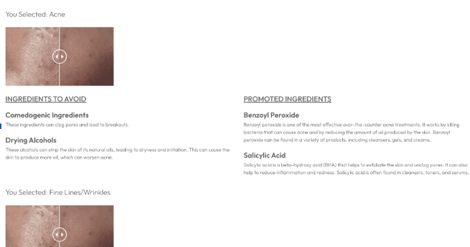
Results screen, concerns shown were not the concerns selected in the prior step
Medium severity
Storefront-wide · false affordances
Things that look clickable, and aren’t
This pattern repeats often enough that it stopped being a one-off and became the audit’s main thread: the Brand Values tiles are styled like cards but go nowhere; the small circular shade-swatches on the PDP look selectable but don’t respond; the Past Survey and Retake Survey buttons render, but do nothing when tapped; the envelope and phone icons on the results page have no defined action at all.
What other beauty & personalization retailers already solved
Teardown / 02
I looked outward before redesigning anything. Three references handle parts of this problem well. None of them get a clean pass, borrowing meant choosing what to take and what to leave behind.
Dior Beauty
Kept- A tabbed PDP structure that lets a buyer choose their own depth instead of scrolling one long block.
Rejected- Dior can lean on brand equity alone. OSAZ needs ingredient and efficacy detail visible, not buried.
Sephora / Charlotte Tilbury PDP pattern
Kept- A short “Add to Bag” button decoupled from product name and price.
Rejected- Decorative review badges without depth. OSAZ’s carousel was more substantive and only needed better placement.
Self-tanner / shade-matching retailers
Kept- Shade swatches that visibly state the selected state with both label and border changes.
Rejected- Quiz prompts that exit the PDP entirely. OSAZ already owns this, so the prompt should stay inline.
What I chose not to redesign
Scope / 03
A 3-week solo+1 engagement can’t fix everything, and pretending otherwise produces a shallow pass over every page instead of a real fix on the ones that matter.
Deliberate cut
The PDP’s full review section and the post-survey competitor comparison table both got cut from the redesign, not patched. The review section was structurally fine- large, slightly misaligned, but functional, so polishing it would have spent budget on something that wasn’t actually costing OSAZ trust. The competitor table was different: it actively worked against the brand, putting “Competitor A” and “Competitor B” labels next to a green checkmark grid that reads as marketing theater rather than evidence. A user who just finished an AI skin survey doesn’t need a feature-comparison chart, they need their own results to make sense.
Three fixes that attack the root cause directly
Redesign / 04
Every fix below maps back to the same root cause: an element on screen was promising something the interaction layer didn’t deliver. The fix is never decoration, it’s resolving the gap between what the UI implies and what it actually does.
Fix 01
Collapse the three-job button into three real ones
Live site
[ Buy GONE Dark Spot Cream $49.00 → ]
One element carries the product name, the price, and the commitment to purchase. A scanning shopper has to read the whole string before knowing what tapping it does.
Redesign
GONE Dark Spot Cream — $49.00 [ Add to Bag ]
Name and price sit as product info, read first. The button only ever does one thing, and says so. The same pattern carries through every card on the grid.
Why this is the fix and not a redesign of the whole grid: separating the three pieces of information didn’t require new components, it required deciding which job belonged to text and which belonged to a button.
Fix 02 - Sold out gets a path forward, not a dead end. Live site: [ Sold Out ]. Redesign: [ Notify Me When Available ]. Same real estate, same visual weight, but the dead end becomes a captured, warm lead instead of an abandoned session.
Fix 03 - The survey results page only shows what the user actually told it. Live site: concerns the user never selected appear anyway. Redesign: the results list is filtered to match input, full stop, and every medical term carries a working, tappable definition instead of a decorative icon.
The clarity pass, once interaction was fixed
UI / 05
Once the false affordances and broken logic were resolved, the remaining work was legibility: contrast, hierarchy, and a navigation system a shopper can actually parse without guessing. This is the layer most portfolios show first- here, it’s deliberately last.

Cart is a labeled icon, not a word that disappears. On the live site, “Cart” rendered as near-invisible text against a white background. The redesign pairs a bag icon with a visible item count at all times.

One CTA, not two competing for the same click. “Take the Quiz” and “Formula One” sat side by side on the original hero. The redesign keeps one primary action and routes the second further down the page.
What I’d stand behind, and what I’d push further
Reflection / 06
What held up
Naming one root cause made every prioritization call faster. Cutting the competitor table instead of redesigning it was the right call. Treating the survey-results mismatch as a logic problem kept the recommendation honest.
What I’d push further
The next pass needs moderated testing with real shoppers to size which false affordances cost the most conversions. Checkout and review submission deserve their own audit, and the sold-out page should be measured against restock sales.
Good skincare UX isn’t the photography. It’s whether the button does what it says.
This project sharpened how I separate a styling problem from a logic problem and taught me to say, in writing, when a fix belongs to engineering and not to design.
Independent UX audit of byosaz.com, conducted as part of a paid 3-week engagement. All copy, screenshots, and interaction issues referenced were captured directly from the live storefront at the time of audit.


