

Independent UX Audit and Redesign
Helping gaming PC buyers turn 40 lines of spec into one decision
ExcaliberPC sells real, current-generation hardware to people who already want to buy it. The interface is the only thing standing between that intent and a completed order. I audited where it breaks and redesigned the path through it.
Role
Solo UX Auditor
Self-initiated
Subject
excaliberpc.com
Est. 2003, Fremont CA
Scope
PDP, Homepage, Checkout
1 representative SKU
Method
Heuristic + 5-user test
n=11 screener survey

Problem
Buyers can’t translate specs into a decision
Every flaw in this audit is a symptom of one root cause: the interface presents component data and assumes the buyer will do the translation themselves. Most don’t, and the ones who try guess wrong often enough that it shows up in task success rate.
The site has the inventory to win and the language to lose.
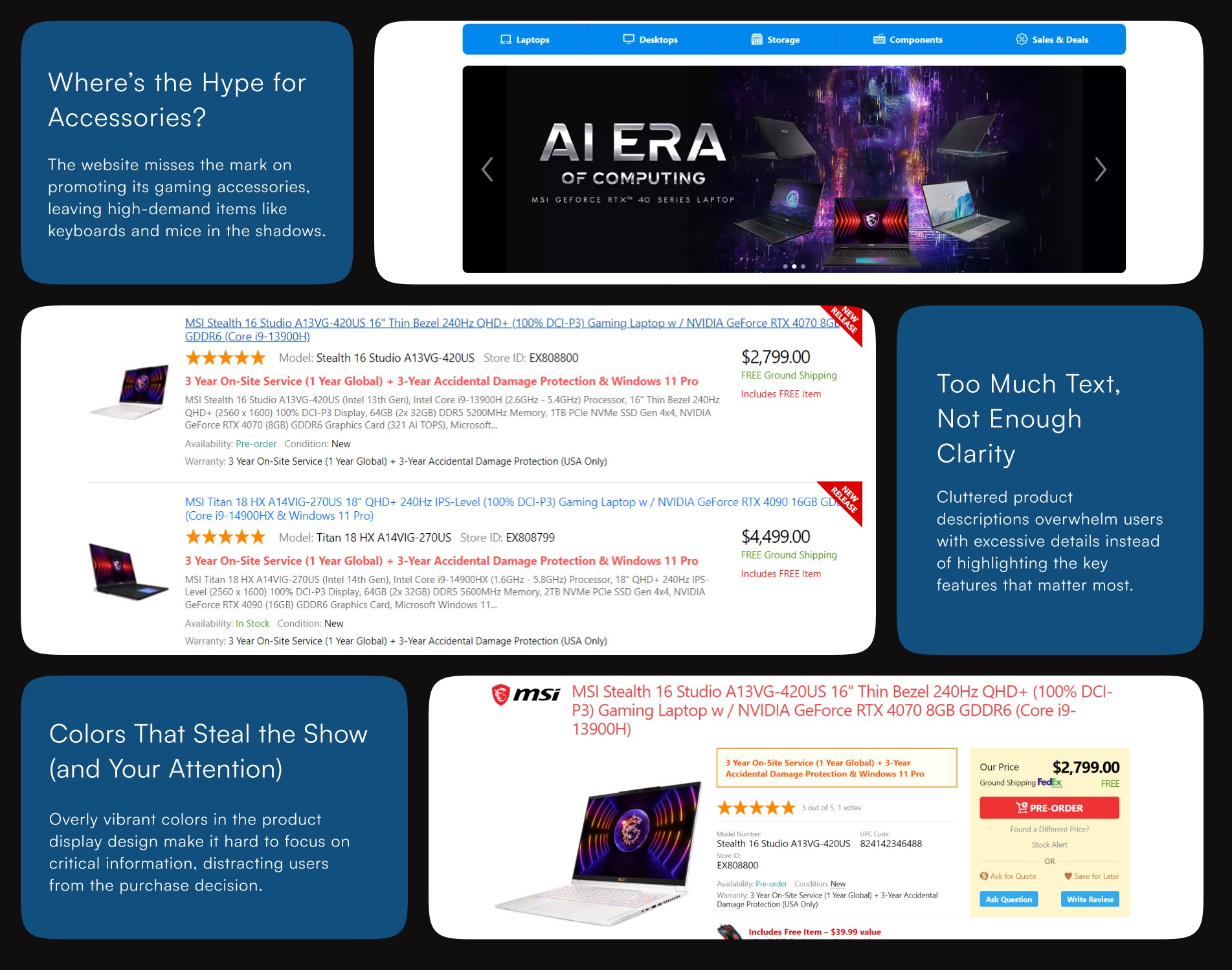
A $2,772 laptop is described in the same vocabulary as its own datasheet. Nothing on the page tells a buyer what any of it is for.
40+
Spec rows per product, zero plain-language layer
158
Characters in the page’s only headline
71
Votes behind a score with no visible reviews
4
Clicks before any plain-language answer appears
Where it shows up
The live product page, reproduced
Before testing anything, I pulled the literal markup. This is the actual headline a buyer sees on a $2,772 laptop, the SKU string, verbatim, with no translation layer above it.
excaliberpc.com/811804/asus-rog-zephyrus…
ASUS ROG Zephyrus G16 (GU605CR-XS97) 16” 2.5K 240Hz (0.2ms) OLED Gaming Laptop w / NVIDIA GeForce RTX 5070 Ti (Core Ultra 9 285H & Windows 11 Pro) - Platinum White
↳ optimized for search indexing, not for the person reading it first
Research
Checking the hunch against real buyers
A heuristic read only proves a designer’s opinion. I ran a screener survey and moderated usability testing to see whether the translation gap actually cost people a decision, or was just a personal pet peeve.
n=11 screener survey
n=5 moderated test
Nielsen’s 10, live site
3-retailer teardown
“I can see it’s 4.5 stars but I have no idea what anyone said. I’d take three real complaints over a number with nothing behind it.”
P3 · evaluating a $2,700 laptop
“I thought the upgrade button was just broken. Nothing told me why I couldn’t pick it.”
P1 · configuring a GPU upgrade
“I had two tabs open just to remember which one had more cache.”
P4 · comparing two similar SKUs
Prioritize specs — 90.9%
Rely on reviews — 63.6%
Task success — 76.7%
76.7%
moderated task success baseline
1 in 4 attempts to find, compare, or buy a product failed outright, not from missing inventory, but from not being able to read what was already on the page.
The path that ends in nothing
Land on PDP → skim SKU title → open spec table → decode jargon manually → leave without deciding


Competitive Analysis
What other retailers already solved and what they didn’t
I looked outward before redesigning anything. Three retailers handle parts of this translation problem well; none solve it end to end.
Newegg
Kept: side-by-side spec comparison and visible review count. Rejected: comparison required too much manual setup before it helped.
Best Buy
Kept: a “why this matters” layer over raw specs and reviews surfaced directly on the PDP. Rejected: generic badges that don’t reflect category-specific buyer priorities.
Razer
Kept: disabled states explain themselves, never leaving the buyer at a silent dead end. Rejected: forced account creation before price clarity.
Tradeoff- what I did not redesign
Checkout and the full review-submission flow are both arguably broken, but I scoped this audit to the PDP and configurator because that’s where the 76.7% task-success number actually breaks down. Fixing the page a buyer spends the most time on before fixing the page they spend the least time on was the deliberate call.
Heuristic Audit and Usability test
Eight findings, one root cause
Plotted by severity and effort to fix. Every point traces back to the same failure: specs presented with no translation to what they mean for a buyer’s decision.
SKU dump as headline
High
Plain-language title above spec string
Reviews scored, never shown
High
Surface 2–3 reviews directly on PDP
Configurator fails silently
High
Inline reason + suggested fix
No plain-language specs
High
“What this means for you” layer

Redesign
Translate, don’t hide, the spec sheet
Both fixes attack the same root cause from different points in the journey: the title, where the buyer forms a first impression, and the configurator, where the buyer’s intent breaks against the catalog’s real constraints.
Fix 01
Headline before SKU
Spec string stays, for search and for power users who want it. It just isn’t the only thing a person reads first.
Built for competitive play, runs quiet
Zephyrus G16 · RTX 5070 Ti · Ultra 9 285H
Fix 02
Disabled options explain themselves
The redesigned configurator states why an option is blocked and what to change, instead of going silent the way the live page does.
RTX 5070 Ti
Selected
RTX 5090
Needs 1TB — switch below


If this shipped
The metric that would actually move
Not conversion first, task success first. The 76.7% baseline exists because buyers can’t finish reading the page they’re already on. Close the translation gap and that number is the one to re-test before claiming any revenue impact.
What held up
Naming one root cause made prioritization natural. Scoping out checkout was right for the testing budget. Borrowing from Best Buy and Razer gave the redesign a defensible why, not just a what.
What I’d push further
n=5 is enough to find the loudest usability problems, not to size the smaller ones with confidence. Checkout needs its own round, and real analytics would be required before treating these numbers as production-ready.
Independent UX audit of excaliberpc.com. Not affiliated with or commissioned by EXcaliberPC.com Corp. All product data, pricing, and page copy referenced are pulled directly from the live public site.


